
Make the website feel as approachable as Lily.
Lily Barretto reached out to redesign CalmTech Support’s existing website. She helps older adults feel more comfortable with their Apple devices, and wanted a site that was easier for her and her clients to use.
The earlier site already explained the service and offered ways to get in touch. The opportunity was to give it a cleaner visual hierarchy, a more cohesive palette, and a stronger personal connection. I handled the new design process through implementation, then extended the work into a flyer she could hand out to businesses.
The same business. A clearer first impression.
The homepage shifted from a large device illustration and a tall introductory section to a more direct introduction: what Lily helps with, who she helps, and how to start a conversation.
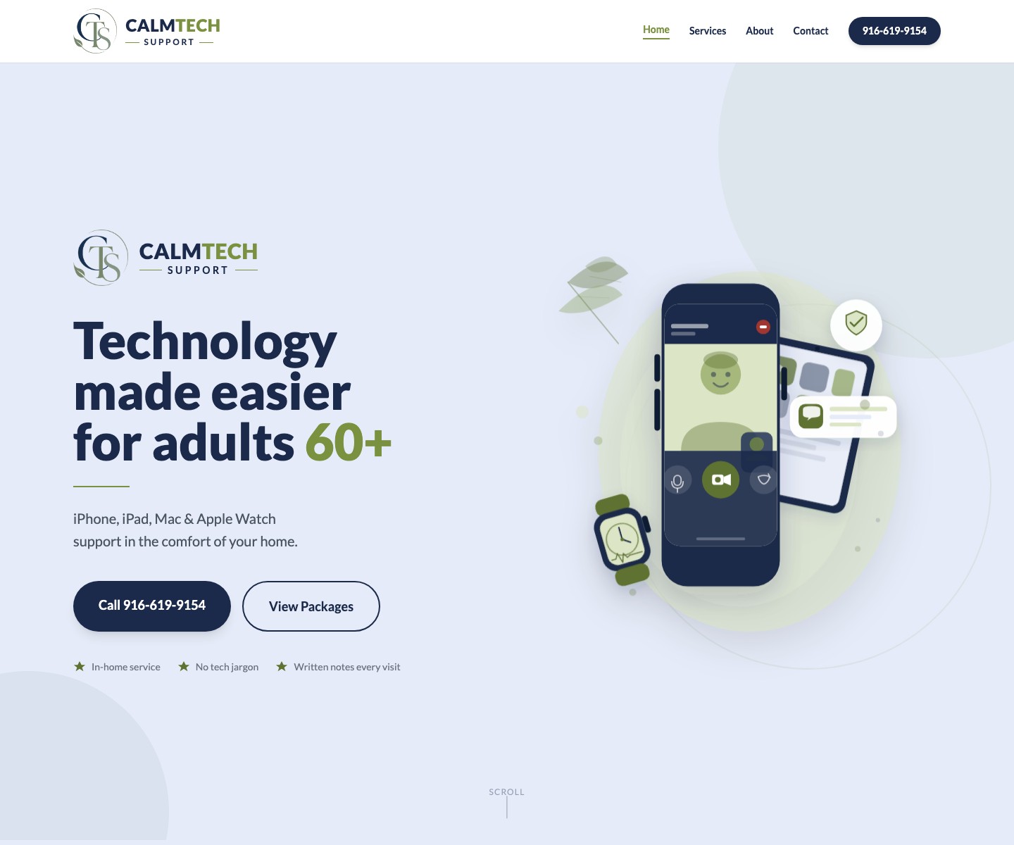
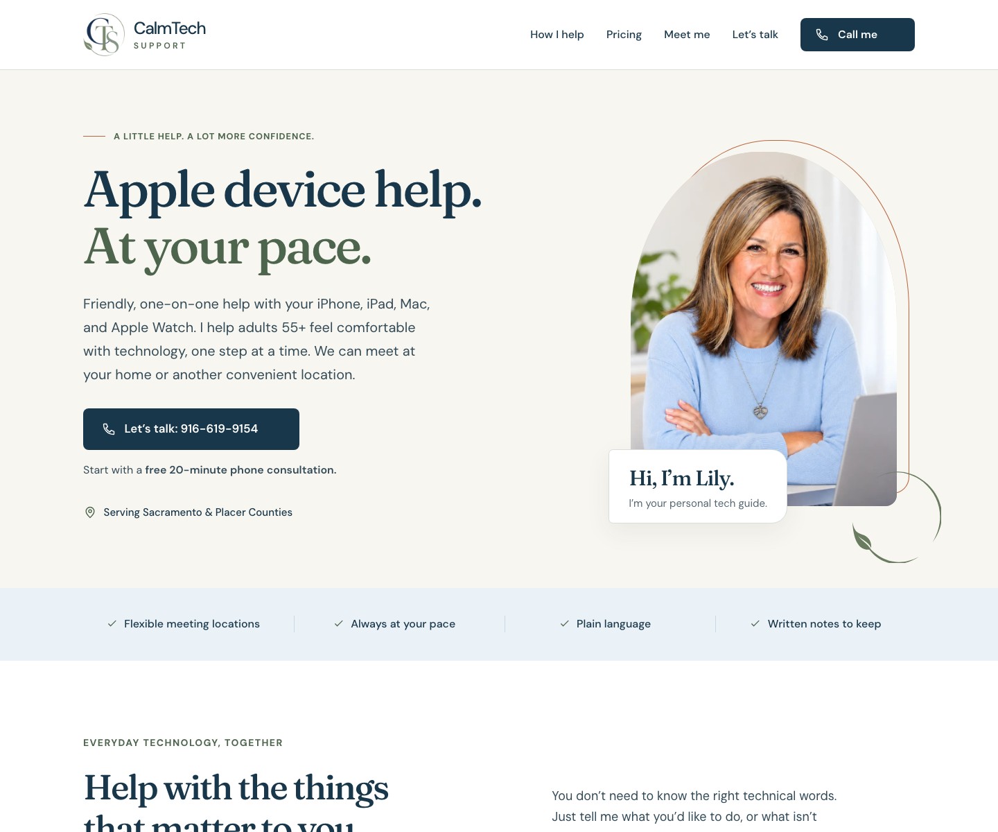
Both homepages shown at the same desktop viewport. Select either image to see it at full size.
A calmer design, with the person behind it up front.
The new visual direction combines warm neutrals, deep blue, muted green, and a restrained copper accent. Clear headings and more deliberate spacing give visitors a comfortable route through the information.
Put Lily first
Photos of Lily introduce the person clients will actually meet, making the website feel personal from the first screen.
Keep the language familiar
Navigation such as “How I help,” “Meet me,” and “Let’s talk” supports the friendly, one-on-one nature of the service.
Make the next step clear
Prominent contact options and a free phone consultation give visitors an easy place to begin.
Bring the pages together
A consistent palette, typography, and layout make service details, pricing, and contact information feel like one complete experience.
The practical pieces behind the new experience.
The redesign included the tools Lily needs to receive inquiries and understand how people use the website, along with clear information for visitors about privacy and site use.
Netlify forms
Integrated contact forms give visitors another way to reach out and give Lily a way to receive requests from the website.
GA4 analytics
Added Google Analytics 4 to support understanding website activity, with an analytics choice available to visitors.
Privacy information
Added a dedicated privacy statement explaining the site’s data handling and analytics.
Terms of use
Added a dedicated terms page, with both legal pages accessible from the website footer.
From the website to a conversation in person.
After the website work, I designed a 5 × 7 inch flyer for Lily to hand out to businesses. It carries the same visual language into print: a personal introduction, a clear explanation of the service, and an easy way to get in touch.
The front introduces Lily and her Apple device support. The reverse focuses on help with online healthcare tools, from finding test results to joining video appointments. Both sides keep the phone number and website easy to find.
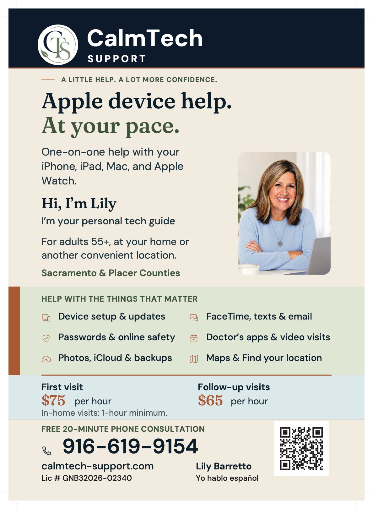
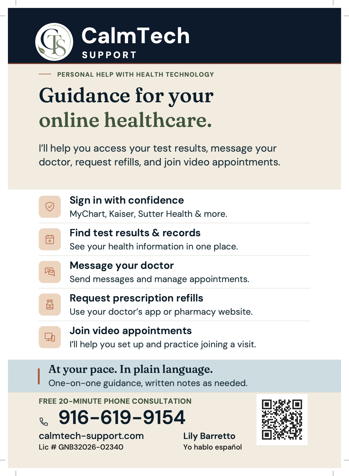
A modern presence Lily feels good about.
Lily was very happy with the finished work. CalmTech Support now has a cleaner, more personal website and a matching flyer to support her conversations with local businesses.
The result brings the business up to date while keeping its purpose simple: helping people feel comfortable asking for technology support. From the first impression to the contact form, the experience is designed to work for Lily and the clients she serves.
- Complete website design process
- New color palette and visual hierarchy
- Cleaner, user-friendly interface
- Personal photography integration
- GA4 analytics setup
- Netlify contact forms
- Privacy and terms statements
- Two-sided 5 × 7 inch flyer
Ready for a fresh start?
Give your business a website that feels like you.
Let’s talk about your current site, what your clients need, and where you want to take it next.
Start a project